
Thank you! Your submission has been received!
Oops! Something went wrong while submitting the form.
From SEO to design, to page speed, and content, ecommerce entrepreneurs depend on our guidance.

As ecommerce experts, it’s our job to shepherd clients toward prudent business decisions in selling online. From SEO to design, to page speed, and content, ecommerce entrepreneurs depend on our guidance. But no matter how great a store’s content or design may be, one surefire way to make a client happy? More sales.
Of course, “sales” is a loaded term. There’s top, middle of funnel, and bottom of funnel aspects to consider.
In this post we’re going to talk about the middle of that funnel, the add to cart strategy. We want to empower you to dig into every store owners’ favorite metrics — checkout conversions.
Because no matter what your client’s store is selling, there is one behavior that precedes all purchase conversions; it’s when a shopper clicks the Add to Cart button.

An ‘aha’ moment is when a customer achieves something promised to them in a marketing pitch — saving money, making more money, having fun, losing weight — we call it an “aha” moment.
In online shopping, these moments, like when a customer receives a new purchase, gets a valuable discount code in-time for a holiday, or receives a useful piece of content in their inbox, can become the highlight of the week.
Put simply, merchants are certain to boost sales and customer satisfaction if they increase the frequency and recency of aha moments for their customers.

But aha moments don’t just happen.
In fact, it’s not uncommon for store owners to learn from Google Analytics that their average shopper:
Spends five minutes browsing the store.
Looks at 10 pages, including FAQs, Contact Us, and Testimonials.
Adds an item to the cart, but abandons 40 percent of the time.
In other words, the average shopper completes a string of baby steps that lead to your client’s number one goal — checkout.
On ecommerce stores, these baby steps are called core behaviors.
Core behaviors can include:
(It’s important to note that not every behavior on an ecommerce site is a core behavior. For example, a user closing one of your pop-ups is not a core behavior. A user sending a support ticket, is also not likely to be a core behavior.)
To determine whether something is a core behavior, just ask yourself: “Is the consumer more or less likely to experience an ‘aha’ moment after this behavior?”
Shopify Experts with this approach to solving problems for clients are more likely to wow them, rather than merely dreaming up the next cool feature, piece of content, or page to browse.
Let’s dive into a few ways to approach your clients’ add-to-cart flows to encourage more expedient checkouts and thus, more aha moments.

This is by far the most aggressive strategy, and the first we want to cover.

By default, adding items to a cart on Shopify keeps the user on the product page. However, for highly targeted traffic (ie, an email newsletter), you may want to send users directly to Checkout.
This can be achieved by overriding the click behavior of your client’s Add to Cart button to point to the following URL:
https://{{ store.url }}.myshopify.com/cart/{{ variant.id }}:1/?return_to=/checkout/
document.getElementById('AddToCart').addEventListener('click', function(e) { e.preventDefault(); // fetch the chosen variant // ... window.location = ‘/cart/{{ variant.id }} :1/?return_to=/checkout/';})
It’s important to use the product’s Variant ID, and not Product ID, for this to work correctly.
Pros
Cons
Our Take
Implementing this storewide will create a frustrating user experience, particularly because it’s difficult to return to a storefront from the Shopify Checkout page.
However, this strategy is great for subscription product one-off sales events.

For example, If you help clients design newsletter themes, one of them could tout the CTA as a “magic button” that “VIP shoppers” can simply click-to-buy, skipping steps and pages. This kind of messaging may lead your client’s shoppers to prefer a hotlink shopping experience.

When a shopper clicks ‘add to cart’ from a product page, generally they continue reading the specs or browse the store for complimentary items.
However, a simple tweak to your theme will redirect users directly to their Cart, leaving the product page immediately after click.

Example implementation of this on a product page:
<a href="https://{{ shop.url }}/cart/add/{{ variant.id }}&quantity=1">Add to Cart</a>
sends user directly to Checkout
example using this product page:
document.getElementById('AddToCart').addEventListener('click', function(e) { e.preventDefault(); window.location = 'https://laluzprinting.com/cart/31879690433:1/?return_to=/checkout/';})
sends user directly to Cart
example using this product page:
document.getElementById('add-to-cart').addEventListener('click', function(e) { e.preventDefault(); window.location = 'https://notifications.myshopify.com/cart/add/?id=35472880838&quantity=1';})
Pros
Cons
If a product has multiple variants, they disappear, which can frustrate the shopper
Average cart value could decrease
Our Take
Take a few notes on your client’s inventory. Are their products complimentary? Can a shopper buy one, without another?
If the store has been live for awhile, you can strategically implement this functionality on products that are typically purchased solo, and let the user stay on the product page for items that often compel cross-sells.
Further, if you do leverage this functionality, consider adding a “related items” module to the Cart page, and give those a Direct-to-Cart call to action as well.
In other words, instead of forcing visitors to visit Product > Cart > Related Item > Cart, you can skip the last 2 steps (and still score 2 items in the basket) by letting shoppers add additional items directly to their cart, from* the cart.

The moment a user performs any core behavior, they either feel good or bad about it. Think of this as the Buyer’s Remorse, Buyer’s Delight dilemma.
How can you design an add-to-cart experience that releases endorphins (positive feelings) whenever a prospect clicks that big button a product page?

This is where the animated cart thrives.
If a storefront performs a brief animation following cart additions, it’s kind of like a little “thank you” show. This small bit of entertainment may also compel a feeling of accomplishment or reward for the visitor’s behavior.
Pros
Cons
Our Take
Pick a point on the diagram below that best describes your client’s products to their customers.

If the store’s products fall on the left end, animations are a good technique.
At this point in the buying cycle, the cart is still volatile, and the shopper could bounce without much regret of their would-be nice belongs.
On the other hand, if the store sells something like health supplements or training materials, it’s less likely to have an effect on the shopper’s intent to purchase.

The sliding drawer is a hybrid approach that combines elements from Instant Checkout, Direct to Cart, and Animation purchase flows.

This cart style guarantees:
Further, the Sliding Drawer technique doesn’t limit your clients to a sidebar.

In the example above, Matchaeologist affirms their shopper that the item was added without obstructing their view of the product details. Win-win.
Pros
Cons
Our Take
Not all shoppers are tech savvy, and a sliding drawer cart can be overwhelming. If users don’t know they can ‘click away’ to remove the lightbox, they may bounce instead.

Further, if a user has more than 3-5 things in their cart, the small sidebar or module window may get crowded, and the final number a user sees at checkout may be different (and irreconcilable) from what they thought was in their cart.
The biggest thing to be wary of with the Sliding Drawer cart is that users could add something to their cart multiple times, and not know it, because there isn’t a dedicated page where the user can take their time to review their pending order.
Now that we’ve covered the 4 ecommerce cart design patterns, let’s create a new framework you can leverage to help your client decide which one is best for their store.
Here’s your homework:
And here’s a matrix for guiding your decision making process:

By presenting these Cart strategies with your clients, you can both reduce surprises up-front for this critical component of a store’s sales funnel, as well as speak in common vernacular about the options available.
As ecommerce experts, it’s our job to shepherd clients toward prudent business decisions in selling online. From SEO to design, to page speed, and content, ecommerce entrepreneurs depend on our guidance. But no matter how great a store’s content or design may be, one surefire way to make a client happy? More sales.
Of course, “sales” is a loaded term. There’s top, middle of funnel, and bottom of funnel aspects to consider.
In this post we’re going to talk about the middle of that funnel, the add to cart strategy. We want to empower you to dig into every store owners’ favorite metrics — checkout conversions.
Because no matter what your client’s store is selling, there is one behavior that precedes all purchase conversions; it’s when a shopper clicks the Add to Cart button.
An ‘aha’ moment is when a customer achieves something promised to them in a marketing pitch — saving money, making more money, having fun, losing weight — we call it an “aha” moment.
In online shopping, these moments, like when a customer receives a new purchase, gets a valuable discount code in-time for a holiday, or receives a useful piece of content in their inbox, can become the highlight of the week.
Put simply, merchants are certain to boost sales and customer satisfaction if they increase the frequency and recency of aha moments for their customers.
But aha moments don’t just happen.
In fact, it’s not uncommon for store owners to learn from Google Analytics that their average shopper:
Spends five minutes browsing the store.
Looks at 10 pages, including FAQs, Contact Us, and Testimonials.
Adds an item to the cart, but abandons 40 percent of the time.
In other words, the average shopper completes a string of baby steps that lead to your client’s number one goal — checkout.
On ecommerce stores, these baby steps are called core behaviors.
Core behaviors can include:
(It’s important to note that not every behavior on an ecommerce site is a core behavior. For example, a user closing one of your pop-ups is not a core behavior. A user sending a support ticket, is also not likely to be a core behavior.)
To determine whether something is a core behavior, just ask yourself: “Is the consumer more or less likely to experience an ‘aha’ moment after this behavior?”
Shopify Experts with this approach to solving problems for clients are more likely to wow them, rather than merely dreaming up the next cool feature, piece of content, or page to browse.
Let’s dive into a few ways to approach your clients’ add-to-cart flows to encourage more expedient checkouts and thus, more aha moments.
This is by far the most aggressive strategy, and the first we want to cover.
By default, adding items to a cart on Shopify keeps the user on the product page. However, for highly targeted traffic (ie, an email newsletter), you may want to send users directly to Checkout.
This can be achieved by overriding the click behavior of your client’s Add to Cart button to point to the following URL:
https://{{ store.url }}.myshopify.com/cart/{{ variant.id }}:1/?return_to=/checkout/
document.getElementById('AddToCart').addEventListener('click', function(e) { e.preventDefault(); // fetch the chosen variant // ... window.location = ‘/cart/{{ variant.id }} :1/?return_to=/checkout/';})
It’s important to use the product’s Variant ID, and not Product ID, for this to work correctly.
Pros
Cons
Our Take
Implementing this storewide will create a frustrating user experience, particularly because it’s difficult to return to a storefront from the Shopify Checkout page.
However, this strategy is great for subscription product one-off sales events.
For example, If you help clients design newsletter themes, one of them could tout the CTA as a “magic button” that “VIP shoppers” can simply click-to-buy, skipping steps and pages. This kind of messaging may lead your client’s shoppers to prefer a hotlink shopping experience.
When a shopper clicks ‘add to cart’ from a product page, generally they continue reading the specs or browse the store for complimentary items.
However, a simple tweak to your theme will redirect users directly to their Cart, leaving the product page immediately after click.
Example implementation of this on a product page:
<a href="https://{{ shop.url }}/cart/add/{{ variant.id }}&quantity=1">Add to Cart</a>
sends user directly to Checkout
example using this product page:
document.getElementById('AddToCart').addEventListener('click', function(e) { e.preventDefault(); window.location = 'https://laluzprinting.com/cart/31879690433:1/?return_to=/checkout/';})
sends user directly to Cart
example using this product page:
document.getElementById('add-to-cart').addEventListener('click', function(e) { e.preventDefault(); window.location = 'https://notifications.myshopify.com/cart/add/?id=35472880838&quantity=1';})
Pros
Cons
If a product has multiple variants, they disappear, which can frustrate the shopper
Average cart value could decrease
Our Take
Take a few notes on your client’s inventory. Are their products complimentary? Can a shopper buy one, without another?
If the store has been live for awhile, you can strategically implement this functionality on products that are typically purchased solo, and let the user stay on the product page for items that often compel cross-sells.
Further, if you do leverage this functionality, consider adding a “related items” module to the Cart page, and give those a Direct-to-Cart call to action as well.
In other words, instead of forcing visitors to visit Product > Cart > Related Item > Cart, you can skip the last 2 steps (and still score 2 items in the basket) by letting shoppers add additional items directly to their cart, from* the cart.
The moment a user performs any core behavior, they either feel good or bad about it. Think of this as the Buyer’s Remorse, Buyer’s Delight dilemma.
How can you design an add-to-cart experience that releases endorphins (positive feelings) whenever a prospect clicks that big button a product page?
This is where the animated cart thrives.
If a storefront performs a brief animation following cart additions, it’s kind of like a little “thank you” show. This small bit of entertainment may also compel a feeling of accomplishment or reward for the visitor’s behavior.
Pros
Cons
Our Take
Pick a point on the diagram below that best describes your client’s products to their customers.
If the store’s products fall on the left end, animations are a good technique.
At this point in the buying cycle, the cart is still volatile, and the shopper could bounce without much regret of their would-be nice belongs.
On the other hand, if the store sells something like health supplements or training materials, it’s less likely to have an effect on the shopper’s intent to purchase.
The sliding drawer is a hybrid approach that combines elements from Instant Checkout, Direct to Cart, and Animation purchase flows.
This cart style guarantees:
Further, the Sliding Drawer technique doesn’t limit your clients to a sidebar.
In the example above, Matchaeologist affirms their shopper that the item was added without obstructing their view of the product details. Win-win.
Pros
Cons
Our Take
Not all shoppers are tech savvy, and a sliding drawer cart can be overwhelming. If users don’t know they can ‘click away’ to remove the lightbox, they may bounce instead.
Further, if a user has more than 3-5 things in their cart, the small sidebar or module window may get crowded, and the final number a user sees at checkout may be different (and irreconcilable) from what they thought was in their cart.
The biggest thing to be wary of with the Sliding Drawer cart is that users could add something to their cart multiple times, and not know it, because there isn’t a dedicated page where the user can take their time to review their pending order.
Now that we’ve covered the 4 ecommerce cart design patterns, let’s create a new framework you can leverage to help your client decide which one is best for their store.
Here’s your homework:
And here’s a matrix for guiding your decision making process:
By presenting these Cart strategies with your clients, you can both reduce surprises up-front for this critical component of a store’s sales funnel, as well as speak in common vernacular about the options available.


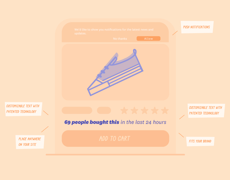
Keep reading, and you’ll learn several social proof strategies you can use to make your potential customers more likely to hit the “Buy” button.
%201.svg)
Don't settle for mediocrity! Experience the power of Fomo and witness a significant boost in trust and conversions on your website - just like 3500+ other businesses!
Try fomo for free now%201.svg)
Don't settle for mediocrity! Experience the power of Fomo and witness a significant boost in trust and conversions on your website - just like 3500+ other businesses!
Try fomo for free now
Your choice in words can be pivotal in shaping the way in which people interacting with you behave.
Don't settle for mediocrity! Experience the power of Fomo and witness a significant boost in trust and conversions on your website - just like 3500+ other businesses!
Try fomo for free now
Boost your sales and conversion with Social Proof
Try Fomo for free*No credit card required